Something new is happening and you guessed it right!
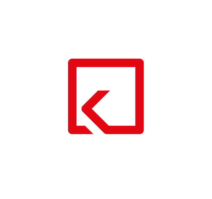
Introducing Keyline’s new logo and accompanying identity!
As we traverse a rapidly changing digital landscape towards our 20 year milestone, we introduce an elegant and modernised makeover of our logo, one that will launch us visually into the age.
We are a brand inspired by innovation, pushing our industry and the people who work in it progressively towards success, in the face of accelerated transformation.
Driven by our philosophy of Create, Communicate and Captivate, we believe that EVERYBODY can learn to express themselves creatively, and harness the power of electronic communication to change the world through digital experiences.
Our bold new logo introduces solid colours and a cleaner aesthetic while encompassing an energetic and dynamic visual language that’s both flexible and adaptable. At the same time, our logo expresses a motion of “ONE SOLID STRONG” – a single line fluidly forming a K, which is further held together in a square, the resultant iconic shape having endless connotations in the practice of art, design and computing – expressing both the legacy and the brand’s continuously flowing evolution.


